Color contrast is the use of complementary colors from the opposite side of the color spectrum. Simply it means making the foreground stand out from the background. Using such complementary (contrasting) colors for text, and images in web pages will maximize the recognizability and readability for all users.
Why is it important?
Color vision deficiency is much more prevalent than we might think. The studies find that on average 1 in 12 men or 1 in 200 women have some degree of color vision deficiency. While it is commonly referred to as “Color Blindness”, the inability to see any color is very rare. Most people with color vision deficiency have difficulty distinguishing between shades of red, yellow, and green. A person with a normal vision would see the number 74 in the image below, but those with red-green color vision deficiency might see the number 21 instead.

Testing for Color Contrast
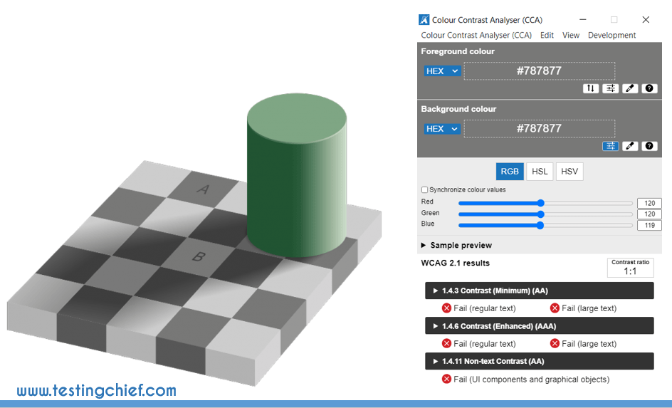
There are a number of tools available for web developers and testers to validate the web content for color contrast. While visually checking for color contrast (manual tests) could identify very obvious issues, it could be deceiving at times. I found this interesting example in accessibility.blog.gov.uk on how our mind can trick us with colors. Squares A and B look like different shades of grey but when checked with Colour Contrast Analyser, both are exactly the same color. How about that?

WCAG Color Contrast Minimum Requirements
Before we look into some of the tools that can help us ease the color contrast testing, let’s look at the minimum requirements for color contrast set forth in WCAG 2.0 (Level AA).
Principle 1 – Perceivable
Information and user interface components must be presentable to users in ways they can perceive.
Guideline 1.4 – Distinguishable
Make it easier for users to see and hear content including separating foreground from background.
1.4.3. Contrast (Minimum) – Level AA
The visual presentation of text and images of text has a contrast ratio of at least 4.5:1. This ratio was set as it compensated for the loss in contrast sensitivity usually experienced by users with vision loss equivalent to approximately 20/40 vision.
1.4.6. Contrast (Enhanced) – Level AAA
The visual presentation of text and images of text has a contrast ratio of at least 7:1. The 7:1 level equivalent to 20/80 vision provides compensation for the loss in contrast sensitivity experienced by users with low vision who do not use assistive technology and provides contrast enhancement for color deficiency as well.
Tool 1: Color Contrast Analyzer
There are several standalone open-source color contrast analyzer tools and my favorite is Colour Contrast Analyser (CCA) from TPGi. It is very simple to use, just use the color picker and pick the foreground and background colors from the screen. It will provide you the contrast ratio and results for WCAG 2.1 compliance. In this Ikea logo example, the contrast is very evident between blue and yellow with a contrast ratio of 7.2:1.

Tool 2: Automated Web Accessibility Checkers
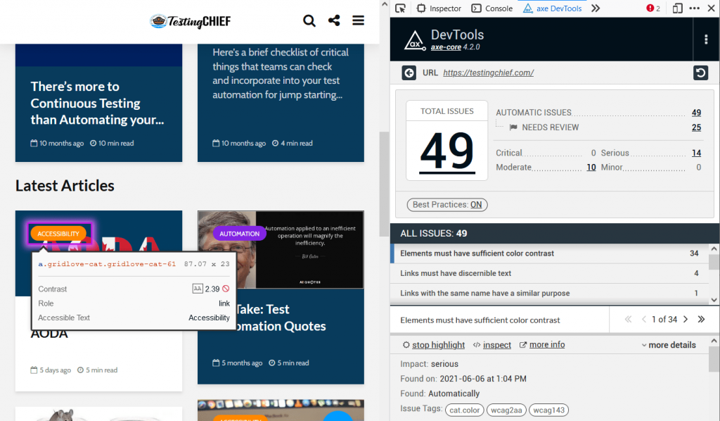
One of the simplest and most commonly used tools for auditing web accessibility is automated accessibility checkers like Axe, Wave, or Google Lighthouse. Open the webpage that you would like to audit, and scan the page with the tool of your choice. In the example below, there are 34 color contrast issues observed on the testingchief.com homepage. The report highlights the exact element where the issue exists and additional information on contrast ratio, type of web element, and even suggestions on how to fix the problem.

Tool 3: Applitools
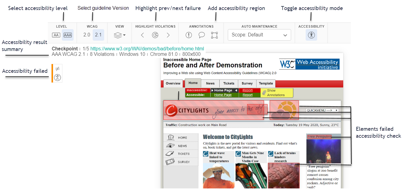
Applitools has revolutionized the automated visual testing with their visual AI. For those trying to automate accessibility testing and/or integrate the color contrast testing with their functional automated tests, Applitools is a good choice. The results are instantaneous, and with options to change levels (A or AA) and WCAG 2.0 or 2.1.

What do you think about accessibility and in specific color contrast? You can leave your comments here or on Twitter @testingchief. You can read my other interesting software testing blogs here.
Additional References:
https://accessibility.blog.gov.uk/2016/06/17/colour-contrast-why-does-it-matter/
https://www.w3.org/WAI/WCAG21/quickref/?versions=2.0#contrast-minimum
https://www.a11yproject.com/
https://www.tpgi.com/color-contrast-checker/
https://applitools.com/contrast-advisor/


